The Secret Recipe of Visual Design

Let’s suppose a brand identity is a uniquely delicious dish and you, the designer, are the chef. You’re in Gordon Ramsay’s kitchen and he’s shouting profanities at you telling you to cook up something brilliant.
Unfortunately, there is no secret recipe for your dish. Honestly, you don’t even know the ingredients. All you have is a few sentences of vague directions, a very hungry customer, and a deadline that was yesterday.
How do you cook something that will delight them beyond their wildest dreams? Every chef will build their own process, but there are a few essential steps they will have to take in some shape or form.
The Ingredients
“Collecting the ingredients. The most essential building blocks of your masterpiece.”
So you have a fancy kitchen fully stocked with all the tools you need. You are ready to dazzle everyone with what you create today. But you soon realise, to dazzle may be impossible. You may be lucky to even serve something up at the end of the day. The vegetables are rotten, the spices are bland, and none of the ingredients match the recipe. What will you do?
The story is the most crucial ingredient to any visual design project.
Before you set out on a path of infinite possibilities you have to get your story straight.
Graphic design is like writing a story with pictures rather than words. For instance, when you build a brand, you have to understand the ins and outs of the business you are building for. Their product, their values, their origin story.
These elements form the story of a brand. The designer uses semiotics and metaphors to add value to the story and make it shine.
A good example of the necessity of story is from a recent freelance branding project I did. I was creating a brand manual for a fintech company. Before jumping directly into visual design, the client and I spent our due time on defining six descriptors (or attributes) of the brand despite a tight deadline.
These attributes were based on not just the founders’ vision but also on a company-wide survey of each stakeholder’s perception of the brand story.
Throughout the process that followed, we came back to the descriptors at each decision point be it deciding the logo, type, color palette, or pattern. These six words gave us a vocabulary and a benchmark to solidify our conversations on visual language and the feelings we wanted to convey. This helped us build a brand manual that resonated with the client’s vision and story, and could serve as a North Star for all projects to come.
Visual storytelling can take many forms. The process to build out that story can also vary from project to project. Without a good story, your brand, or any visual design will begin to fall apart.
With the intent to tell a story that is true to you and the client, you set yourself on a path to stand out from the crowd. You have the quality ingredients, now it’s just a matter of using them right.
Try, Try Again
“Your first dish is probably going in the trash, and your second. And third. Even the last one you make is eventually going to need some seasoning adjustments.”
So you’ve put hours and hours into your very first dish and the customer found it, in the very best way I can put it, ‘meh’.
When someone doesn’t like what you cook up, It can be an emotional process to receive that feedback, process it, and get back to cooking. Any chef who doesn’t feel that tinge of pain when their best dishes are discarded is either lying or a sociopath. However, with experience, it does get easier.
Designers are no different. It helps to start off with as many ideas as possible. Using the stories and metaphors you define as an anchor, you should come up with an exhaustive list of ideas. Go crazy. No, really. Go. Crazy. Even the ideas that you think will be mocked in feedback (they probably won’t) are important.
A major pitfall for beginner designers is coming up with three ideas and believing all three of them are good. A veteran designer on the other hand, comes up with a hundred and carefully picks three. Rest assured, even those three will need changes, tweaks, and adjustments.
This lesson is something I learnt the hard way in graduate school. I was a self-taught designer before that and imagined myself to be pretty competent.
Feedback from professors in graduate school hit me like a truck. Suddenly, everyone around me was tough to impress. This is when I slowly started to realise that building a quality process was essential to produce quality work consistently.
building a quality process was essential to produce quality work consistently.
It was a growing process spanning many months, and some proverbial tears, but it was essential to level up as a designer. After those months, my process became much more rigorous and my work improved dramatically.
To sum it up, it is best to accept iterations as part of the process. The earlier and more comfortable you become with iterations, the easier it gets. It is important to gradually silence that tinge of pain that you feel when your ideas are rejected. To focus on the quantity of ideas in brainstorming and leave refinement for later.
In building that habit of rapid iteration, you will learn to refine your designs and eventually make them true to the story you and your client are trying to tell.
Plating Up
“How can a restaurant charge Rs. 5000 for a dish made out of ingredients that barely cost Rs. 1000. One word: Presentation.”
Remember, you are the chef. You can appreciate each ingredient in the recipe separately. However, your audience is not the expert. You synthesise the ingredients and present them in a manner that they can feel viscerally. They can tell whether they like it or not, but can’t quite point out how and why. Some may yet be able to do it well but the fact remains:
The better you present it, the more appetising it will be.
The better you present it, the more appetizing it will be. I am guilty of this often: As designers, we forget that we have a different imagination from our client or audience. During the process, we sometimes are baffled why our best ideas are met with indifference. Often, it’s the presentation that is lacking.
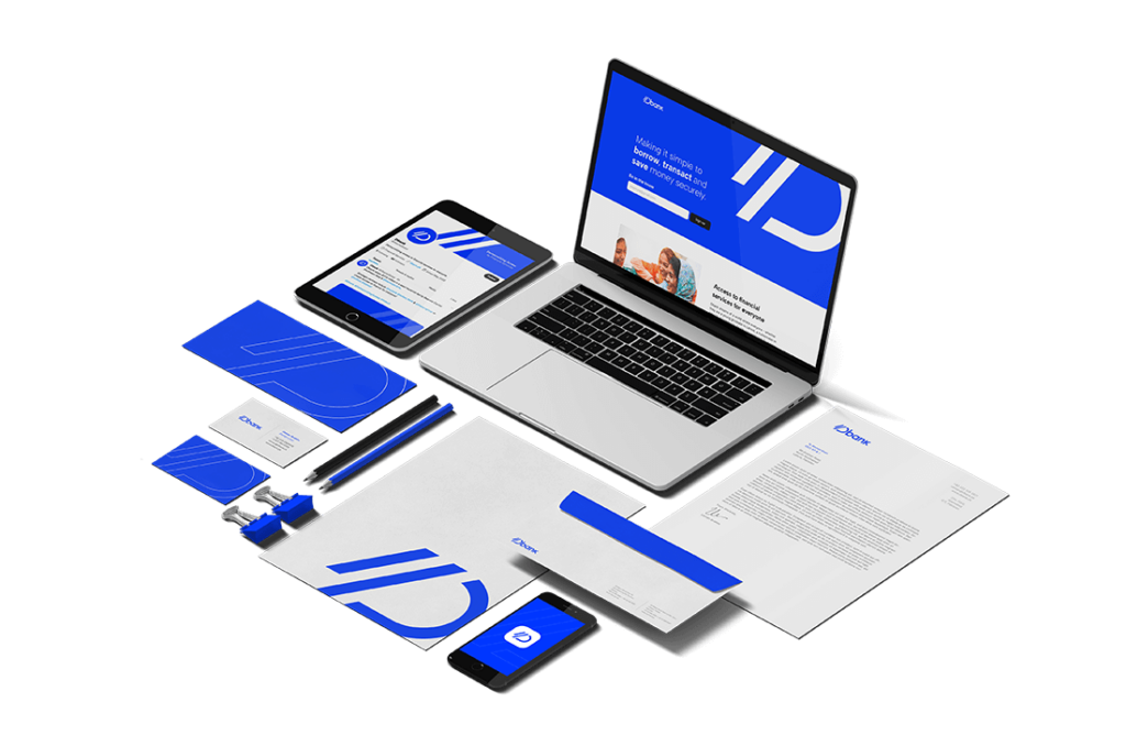
When we present our ideas, for instance logos, it helps to add a little flair to help jog the imagination. What would it look like applied to a billboard, a tote bag, or a credit card? Easy for us to take for granted, right? But it helps the client visualise it. Makes it more real. It helps them anticipate the value of what you are creating for them. It makes an easier sell for you.
This is something I learnt working here at Rayn Studios. Other than building products, I build brands for our different ventures. The feedback process is a bit more friendly, and manageable when the client is internal. However, presentation remains important, especially when showing ideas to non-designers. When I put that extra effort into presenting mockups rather than unrefined ideas, the feedback is that much more positive.

Understanding the importance of presentation is something that elevates not just the quality of your work but the sellability of it too. Often, we see a logo we make, and we can imagine everything it will be put on and how it would look. Your audience can’t.
Just spending a bit more time on jogging their imagination will make it all the more likely that the logo option you love, is the one that is picked.
Next time, rather than presenting black and white logos, try putting together a stylescape. Sit back and see the reaction.
Every chef and designer is unique. Throughout your career, you will build and refine your own creative process. There are a million ingredients that can be combined in a myriad of ways. Through building a rigorous process – that is based on a few basic principles – you can ensure that you build compelling designs day in and day out.
Remember, when the power of strong storytelling, exhaustive brainstorming, and stellar presentation combines, creative magic unfolds!


