Product Analytics: Reports & Insights

Visualizing several metrics may seem overwhelming since there is so much we want to know about our product. To make this process simpler, let’s review the 4 common types of reports used for product analytics.
Reports are templatized visualizations that can help uncover insights in a structured manner. Leading product analytics tools already have these report templates available for quick analysis. This article discusses some common types of reports used and the types of questions they can answer about your product.
To learn more about which metrics you should track and visualize, read the 6-step framework to implement product analytics.
1. Basic Insights Reports
These reports can help you understand the frequency of certain events, monitor app breakages, visualize usage trends, and compare customer segments using different chart types which include:
- Barcharts
- Time Series charts
- Pie-charts
- Histograms
- Scatter plots
- Data tables
- Scorecards
Let’s take a look at the type of questions you can answer with these reports:
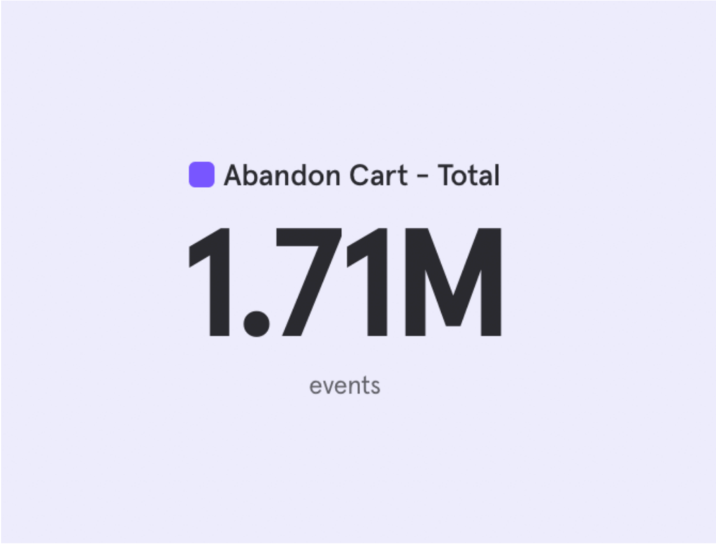
How many users abandoned their carts?
A scorecard shares one aggregate metric which can help give an overview of an event’s occurrence. You may want to dive deeper to understand this with another report on the event’s trends or segments.
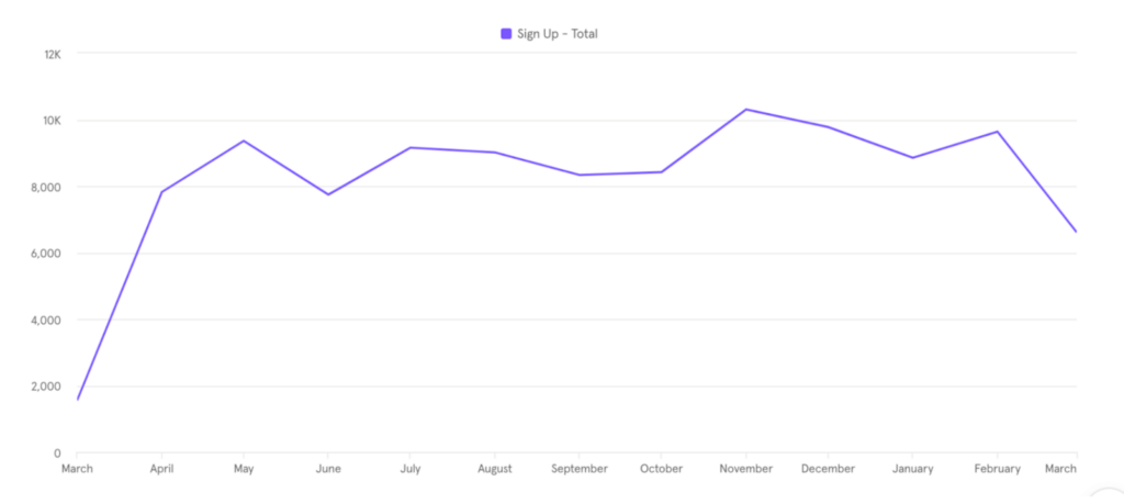
How many people signed up for my app over the year?
A simple time series chart can display an event’s trend over the year. You can customize the time axis to look at data for a specific month, week, or even a day.
What common methods are users using to invite their friends to the app?
A bar chart can answer the question by showing the number of friend invitations sent through the different invitation methods available. Bar charts can be helpful for comparing an event across multiple properties.

What are the most common search terms used on the app?
A data table can display the required information which can be helpful when exact numbers are needed for further analysis.

Where is the loyalty program being used the most?
A pie chart can give a breakdown of all the countries where users actively use the loyalty program.
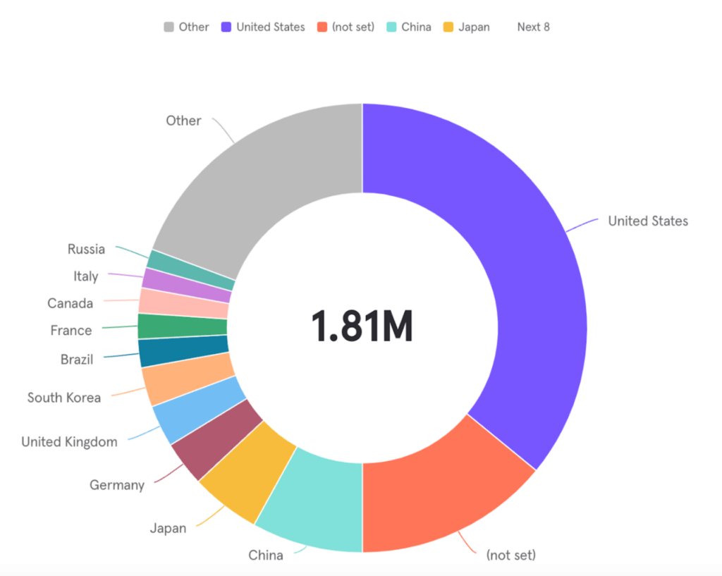
As you can see, basic reports are flexible and can be customized to get the exact insights you require. Additional capabilities to get granular insights through these reports can include filtering and breaking down charts based on specified parameters or dates.
2. Funnel Conversion Reports
Funnel conversion reports are important when you want to visualize users completing a user flow (a sequence of user actions/events). The report highlights steps that lead to high drop-offs and the percentage of users who complete the user flow.
Drop-offs can indicate a problem in the user flow which could include users being hesitant, users not being clear on the next step and the product stopping the users from proceeding due to system errors. Insights from this report can help drive changes needed to ensure most users complete the user flow.
Let’s look at a question this report can answer:
Which step has the highest drop-off for the following user flow:
Step 1: Sign Up
Step 2: Content Posted
Step 3: Invite Friend
Users are supposed to sign up on the social network, post content and eventually invite a friend to join the platform.
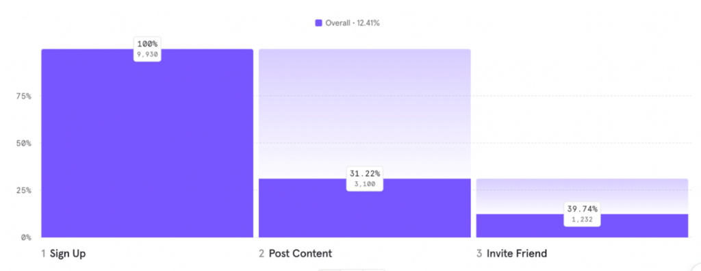
Through the funnel report, we can observe a huge drop-off between signup and content posting. Ideally, most users joining the platform should be posting content. At this step, you’d want to understand the difference between these two segments of users to eventually devise a product strategy geared to convert the drop-offs.
Segment Analysis using Basic Insights Reports:
That’s where segment or cohort analysis comes in. A segment or cohort is a group of users with a common characteristic. In this case, one of our segments comprises the users who converted in the funnel and posted content, while the second segment is the set of users who dropped off and didn’t post content.
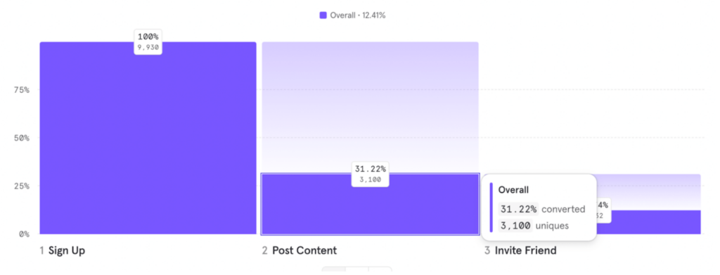
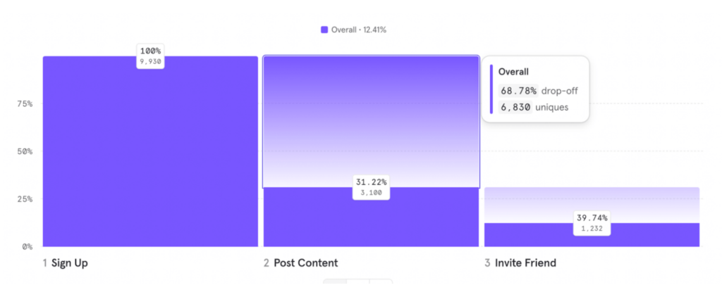
Coupling segments with a basic insights report can help us visualize the demographic or behavioral differences between the two segments. Maybe a specific gender is dropping off more than the other, or those who signed in through referrals are more likely to post content than those who joined organically. Insights reports provide the flexibility required to explore the data and get to our answer.
3. User Flow Reports
Previous reports follow the user flow we expect the user to follow. But what if we want to know what the user actually does on the app? There can be a difference between the expected behavior of the user and what they actually do.
User flow reports (also called spider charts) provide unfiltered exploratory paths for us to understand what a user does on the platform. It provides the most common paths users take to get to a specific step.
Let’s look at a sample question this report can answer:
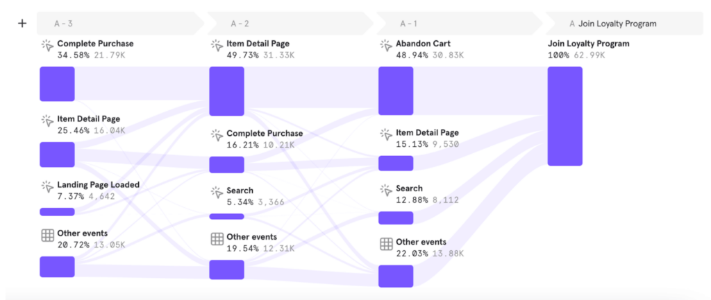
How does the user reach the “Join Loyalty Program” step?
The following example illustrates the last three steps the users took before joining the loyalty program. Most users had already completed a purchase before they joined the loyalty program while some were browsing their second cart before taking this decision.
4. Retention Reports
Retaining users is key to a product’s long-term success. Retention reports visualize user engagement over a period of time. They show how long users take to come back to the platform to take a desired action.
Let’s look at a question answered by this report:
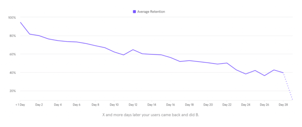
How long do users take to complete a purchase after adding products to the cart?
The following retention report shows that under 20% of users complete the purchase on the same day as when they added products to the cart. We can also see that half the users can take up to 20 days to complete a purchase.
We can then compare these metrics with industry standards to understand if these metrics are ok, or if we need to improve the retention rate.
To summarize, these 4 reports can answer most of your product questions. You can also create custom reports or a combination of these reports to answer questions specific to your product.


