Towellers: modernizing a traditional textile company

The Client
Towellers is a leader in textile production in Pakistan with exports of over $55 Million. The company was established in 1973 by Mr. Shaikh Muhammad Obaid with expertise in towel-making but has since expanded its portfolio, under the leadership of Mr. Obaid’s daughters, to cater to a diverse customer base globally. Towellers is the only female-led textile manufacturing company of Pakistan.
The Challenge
Towellers wanted to reach a new audience, seeing the market evolve and understanding the importance of evolving with time, they wanted a fresh take on their business while keeping their legacy and story intact. They wanted us to create a timeless website with a combination of strategy, visual and verbal storytelling, that would be appealing to a younger audience and could also be used as a portfolio to meet clients internationally and locally, while following very particular guidelines from the Securities and Exchange Commission of Pakistan (SECP).
Implication
Towellers has a number of high profile apparel and textile brands as their clients. Maintaining a working relationship with their existing clients as well as bringing in new ones meant that the Towellers brand also had to keep up to date with evolving market trends. Using their website as one of the major tools to propagate the Towellers brand, there was a disparity between them and their website. Being a women led company, the dynamic and futuristic vision was missing from their website which also had an impact on how they were unable to legitimize their interactions with global clients.
Solution
Our goal was to achieve a synergy between visuals and content to do justice to the story behind Towellers. We started off with presenting multiple approaches and ideas to the client to see what they and their existing brand resonated with. Once we had finalized an approach for the visual language, we started building a sitemap and wireframing the website.
The prior structure of the website was very broad. With 10+ options in the top navigation, it was confusing for the user due to too many choices. We narrowed it down to 7 for a more streamlined experience.
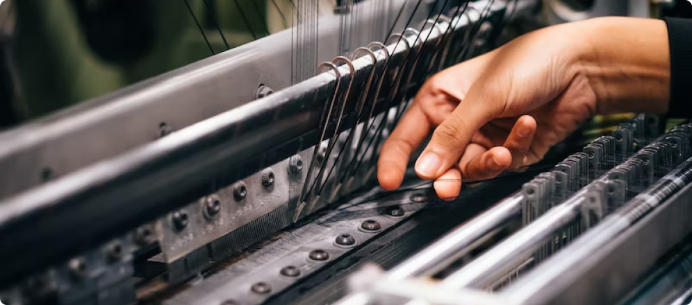
The visual design of each page was guided by a visual language that was a good balance between the existing brand and its future vision. To execute this, we had a deep focus on the photography and videography of the products as well the facilities of our client. We also had a special focus on the microinteractions so that they were not arbitrary elements but embedded in the storytelling. This manifested itself in the thread that guides you through the experience.
The written content was re-worded in order to create a narrative that was more engaging yet remained loyal to the history and legacy of Towellers. We took the essence of the brand, their legacy, used it as a north star and did everything as an extension of that legacy. By incorporating latest photographs and videos of their products and facilities we were able to reflect the expansion and growth of the brand. We also made sure to include their sustainability efforts to reflect a new era of a young leadership that was socially conscious, ready to meet with the demands of international clients to retain their position as a market leader.

Results
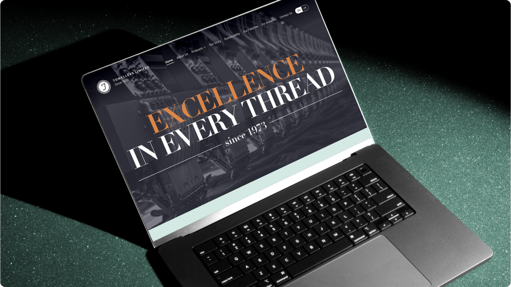
The outcome of our efforts was a website that did justice to the quality, legacy, and scale of Towellers. After developing a deep understanding of the existing brand, the business goals, and the best attributes of the organization, we built a website that put all of these to the forefront.


