Storytelling with Data: The Power of Visualizing Information

- Yousra Ansur

Introduction
Many people find data overwhelming and exceedingly difficult to comprehend, especially when presented in large sets or spreadsheets. However, with the power of data visualization, you can transform complex information into a captivating story that is both easy to comprehend and memorable.
In data visualization, raw data is transformed into graphical representations that can be easily interpreted. There are many forms of representation, such as charts, graphs, maps, etc. The objective of data visualization is to make the data easier to understand by making it visually appealing and informative.
Telling a Story with Data
Stories have always been a powerful tool for human communication, with the ability to convey complex ideas and emotions in a way that resonates with people. When it comes to data visualization, storytelling is equally important.
An important aspect of telling a story with data is how it enables the narrator to contextualize data within the context of a larger objective. In this way, the audience can easily understand the results and their implications, regardless of their background, expertise, or technical sophistication, irrespective of whether they are experts in a particular field or not.
Using data storytelling is also a good way to simplify data for individuals with different learning styles and allow the narrator to cater communication methods to his or her audience. For instance, an auditory learner may respond better to a spoken presentation while a visual learner may require more data visualizations and other visual aids. Generally, a good data story incorporates all of these components to engage a diverse audience.
Choosing the Right Data Visualization
When it comes to data visualization, there is no one-size-fits-all solution. The type of visualization you choose depends on the data you're presenting and the story you're trying to tell. Here are some common types of data visualizations and when to use them:
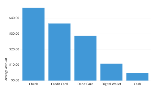
Bar Charts: Best for comparing data sets.
Line Charts: Good for showing trends over time.

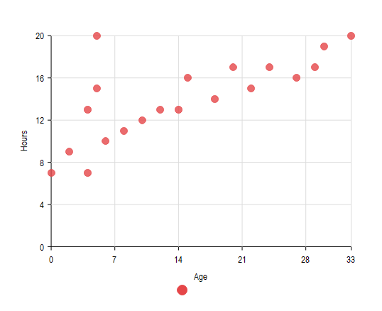
Scatter Plots: Useful for showing the relationship between two variables.
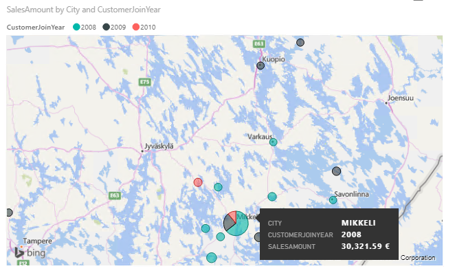
Maps: Great for visualizing geographic data.
Infographics: A visually appealing way to present more information in a small space.
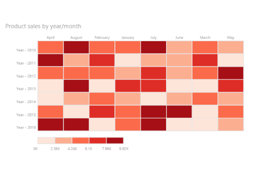
Heat Maps: Useful for showing patterns and trends in large data sets.
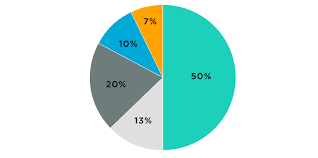
Pie Charts: Popular for showing proportions or percentages.
When choosing your visualization, remember to keep it simple and clear. Avoid using too many colors or visual elements, which can make your visualization confusing and difficult to understand.
Creating a Narrative Structure
Once you've chosen your visualization, it's time to create a narrative structure for your data. This involves organizing your data into a clear beginning, middle, and end, with a clear message or takeaway for your audience. Here are some tips for creating a narrative structure:
Identify your main message or takeaway: what do you want your audience to remember?
Create a clear introduction: set the stage for your data by providing context and background information.
Build tension or suspense: create a sense of urgency or interest by highlighting the importance of your data.
Present your data: use your chosen visualization to present your data clearly and compellingly.
Provide context: explain the meaning and significance of your data, and how it relates to the larger story.
Summarize your main message: restate your main takeaway and provide a call to action for your audience.
Adding Emotion and Humanity
Data can often feel dry and impersonal, but adding emotion and humanity to your visualizations can make them more engaging and relatable. This involves using storytelling elements like characters, settings, and anecdotes to bring your data to life.
Here are some tips for adding emotion and humanity to your data:
Use real-life examples: illustrate the impact of your data by providing real-life examples and anecdotes.
Use visual metaphors: use images or metaphors to connect your data and your audience.
Use storytelling techniques: use the same techniques you would use in a good story, like creating suspense, using dialogue, and building characters.
Testing and Refining Your Visualization
Once you've created your visualization, it's essential to test it on a few people to see if they understand. These people should come from varying backgrounds. Here, it is also critical to ensure that the majority of people can understand the key point precisely as you intended to deliver it, else, fine-tune your visualizations until they do. This criterion helps you feel confident that your data is relevant and is presented in a way that is easy to understand by the masses.
Conclusion
In conclusion, storytelling with data is a powerful tool for communicating complex information in a way that is both memorable and easily understood. Whether you are a marketer, data analyst, or simply someone looking to communicate information effectively, the tips and techniques outlined above can help you create captivating data visualizations that will engage and inform your audience, as well as, help you demonstrate the true potential of data when it is presented appropriately.